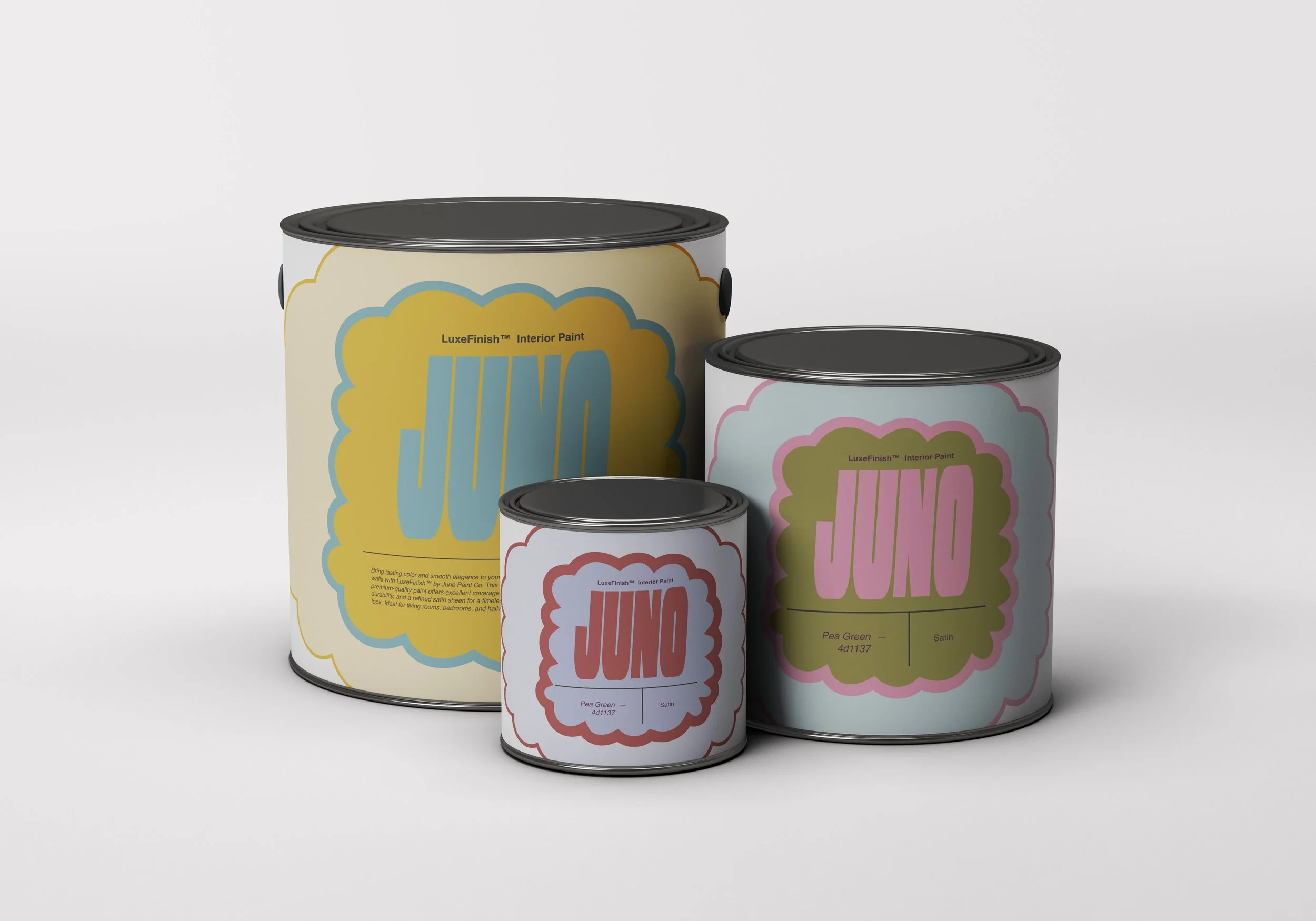
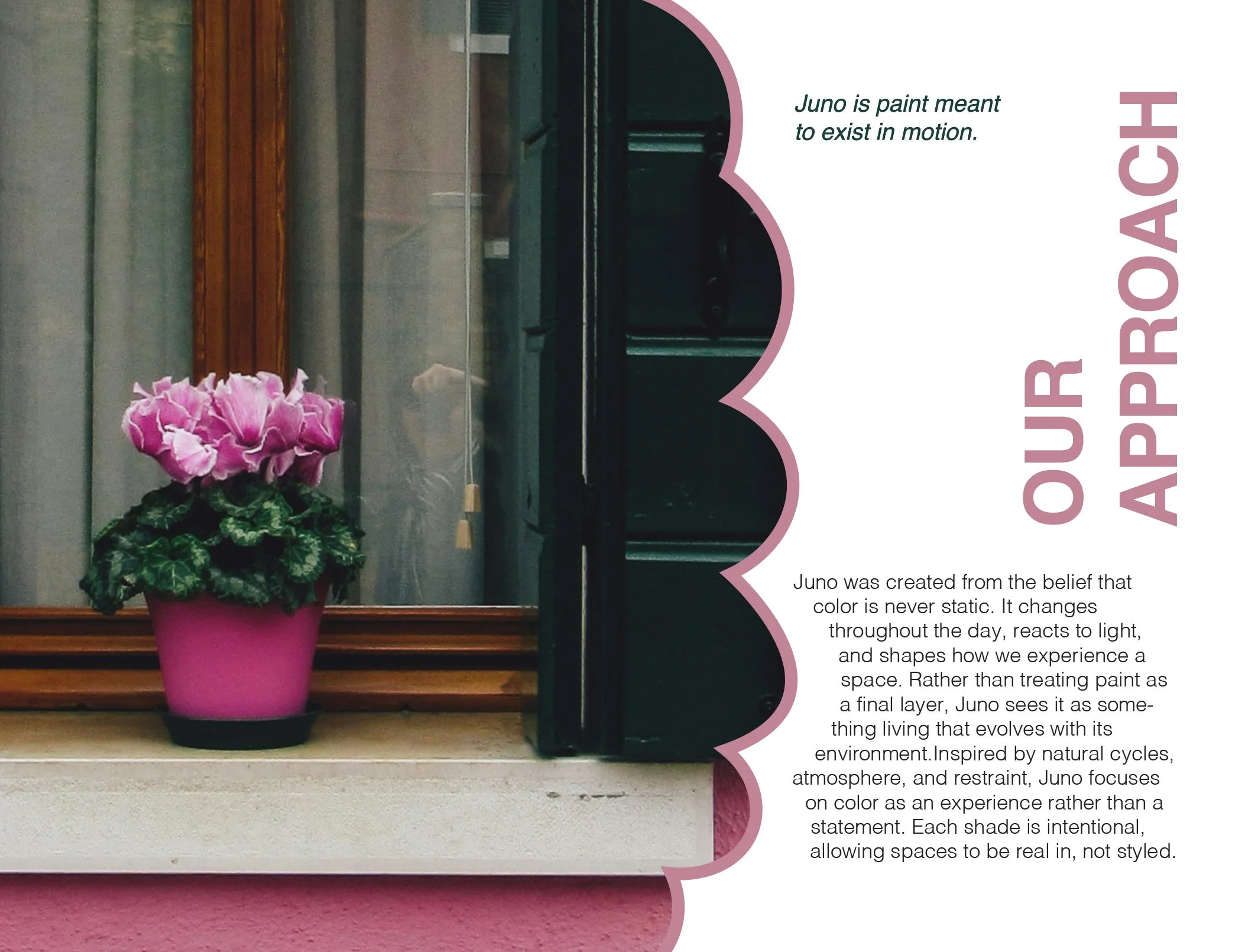
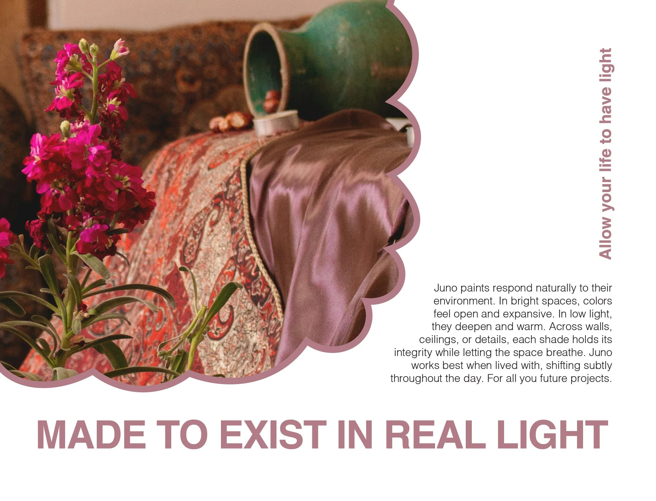
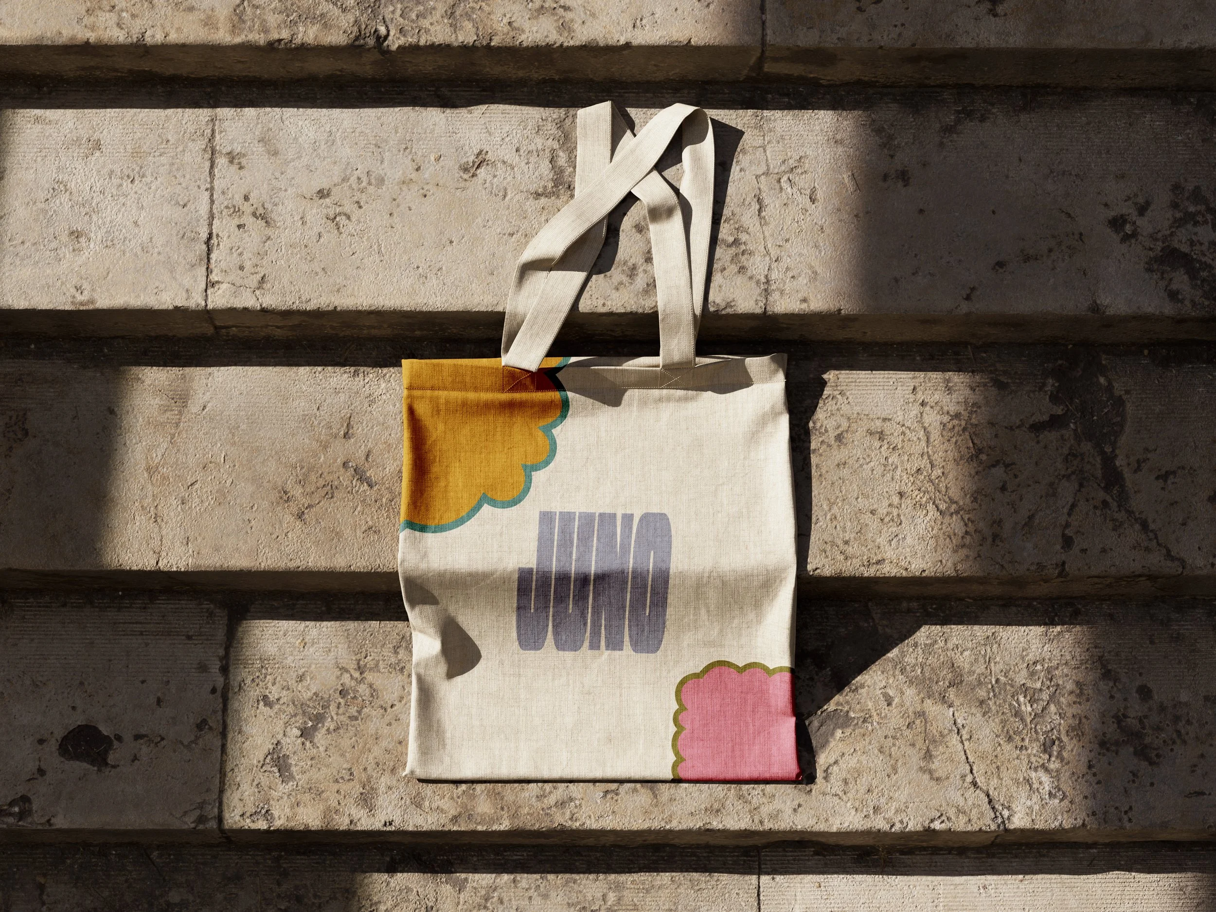
JUNO

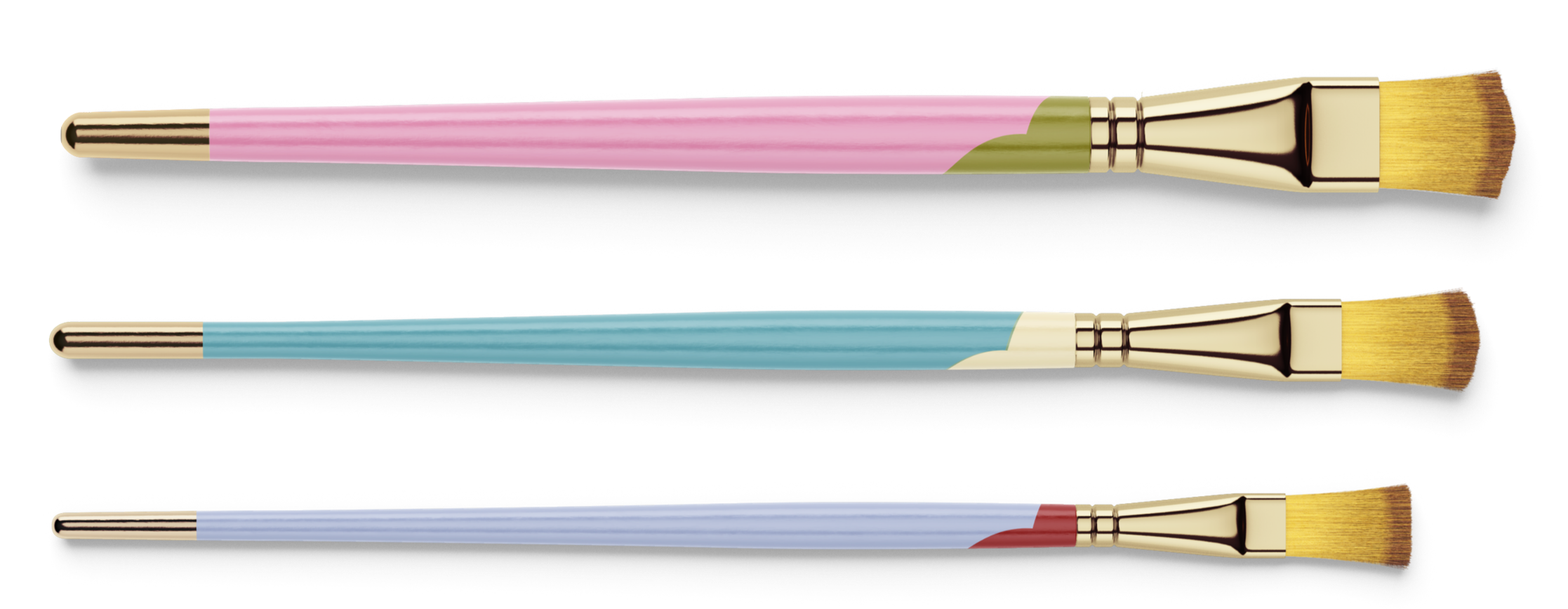
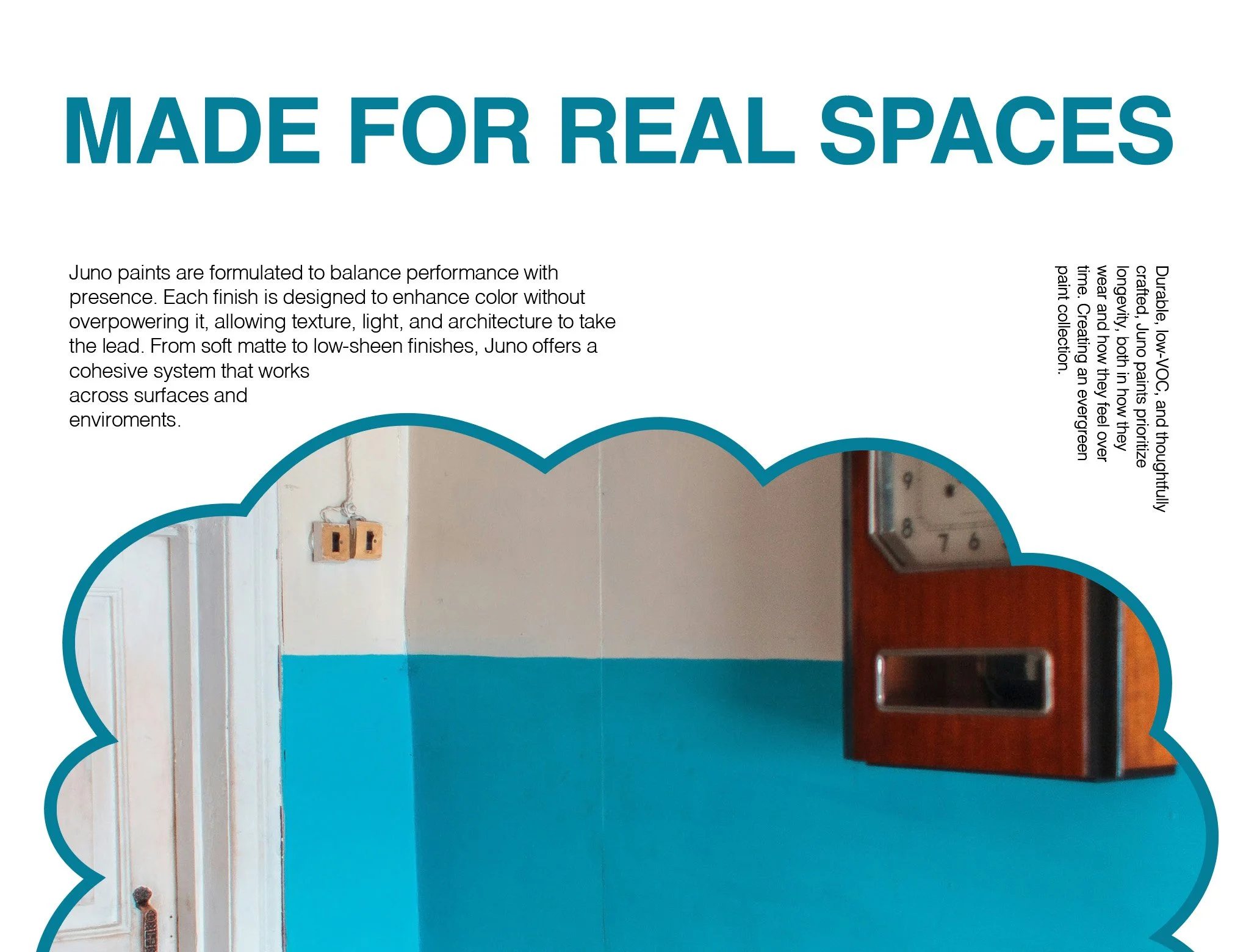
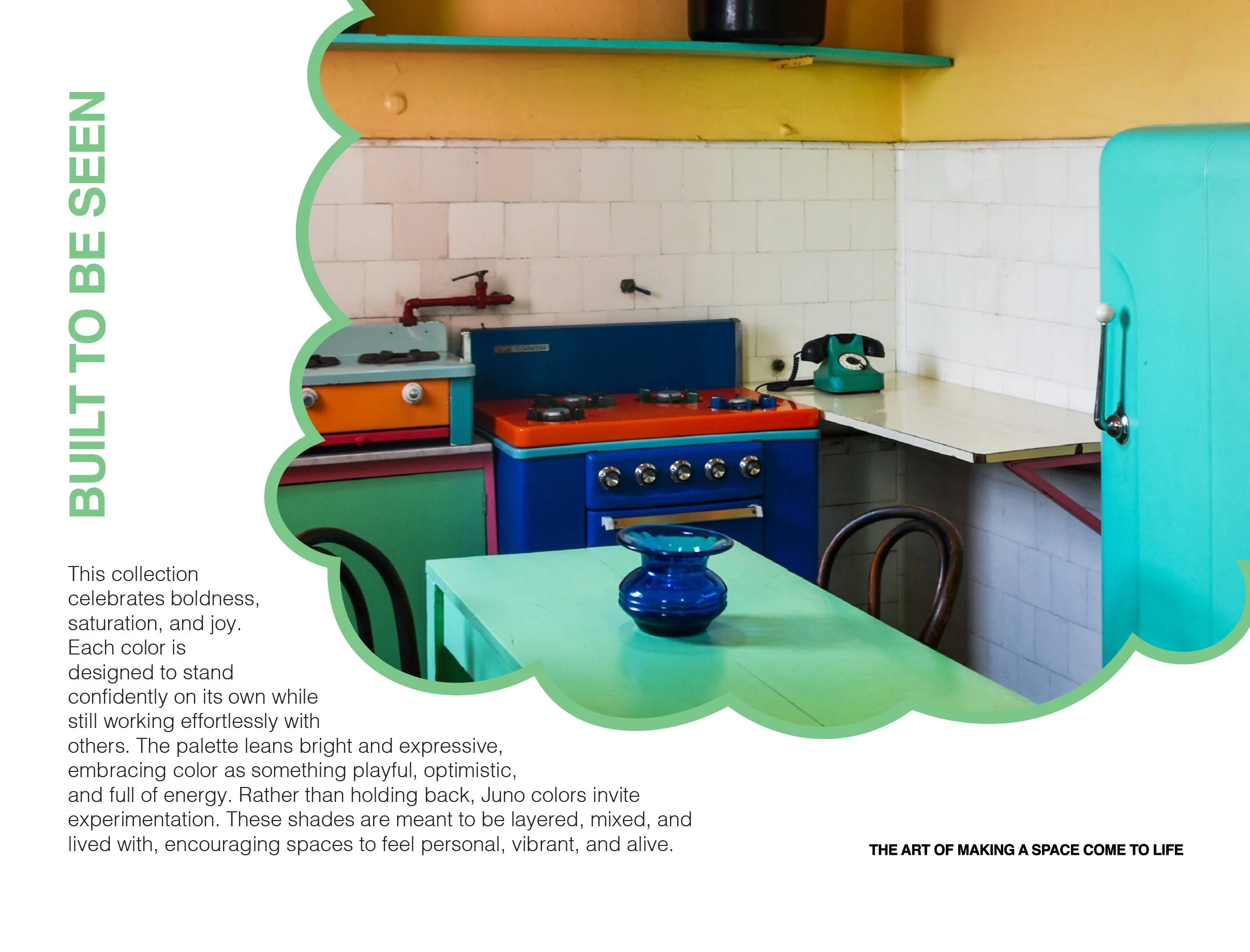
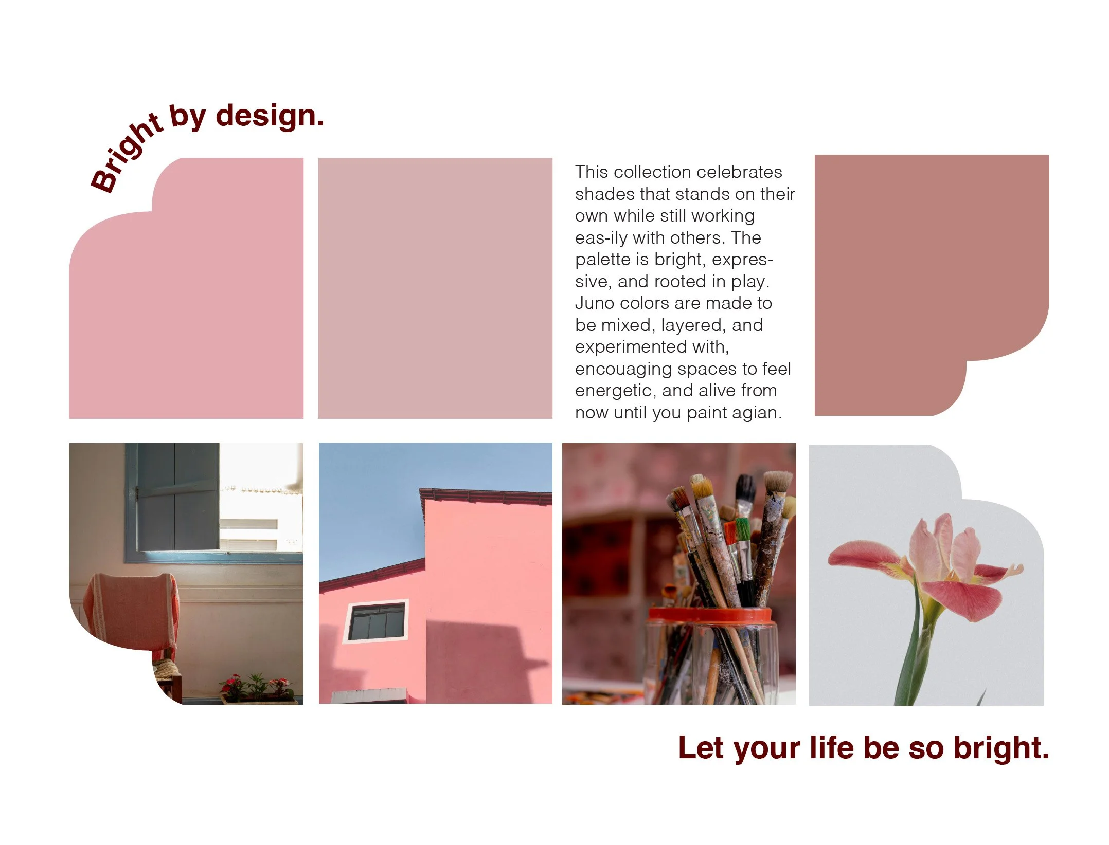
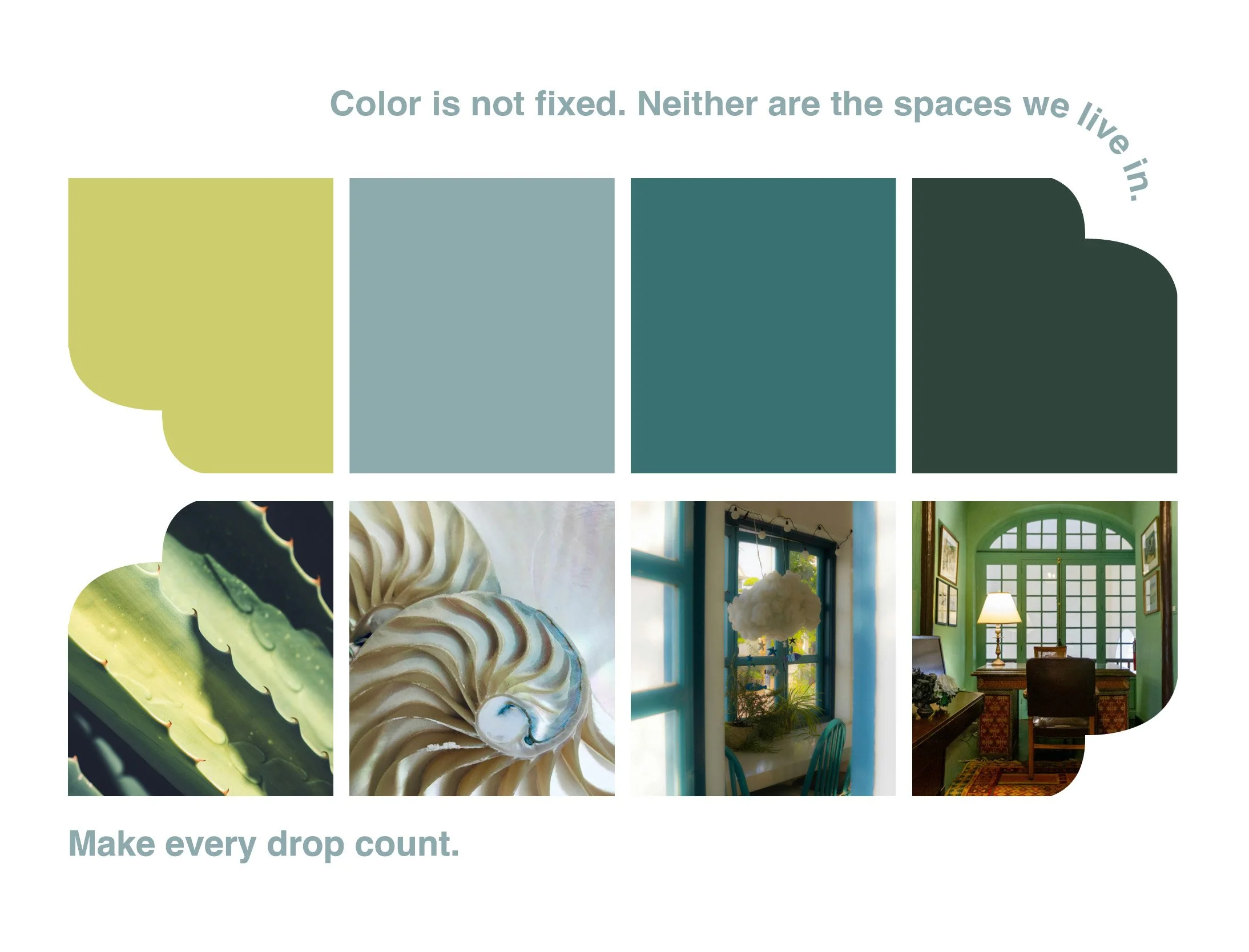
For this project, I developed packaging for a paint brand by creating a flexible brand system rooted in playfulness and form. Shapes were used as the primary visual element, guiding both the identity and the overall packaging experience. This approach reflected the DIY ethos of the assignment, emphasizing creativity, approachability, and self-expression. At the same time, the visual language was designed to communicate eco-friendly values through simplicity, clarity, and optimism, resulting in a cohesive and engaging system that feels fun, dynamic, and accessible to a wide audience.